2025
Helpdesk UI vision

Overview
At Gorgias, the helpdesk is where support agents spend their entire day, and the interface had stopped keeping up with them. This was a vision project to reimagine the core helpdesk experience around three goals: scalability (grow enterprise revenue with a flexible, powerful product that doesn't sacrifice ease of use), efficiency (speed up ticket resolution with faster access to key info and AI-powered workflows), and confidence (lift NPS by making the platform easier to navigate, search, and control). The guiding idea was that the helpdesk should become a platform every team, including third-party developers, can build on. The work was deliberately collaborative and produced an interactive prototype plus a shared direction the wider org could rally behind.
Problems
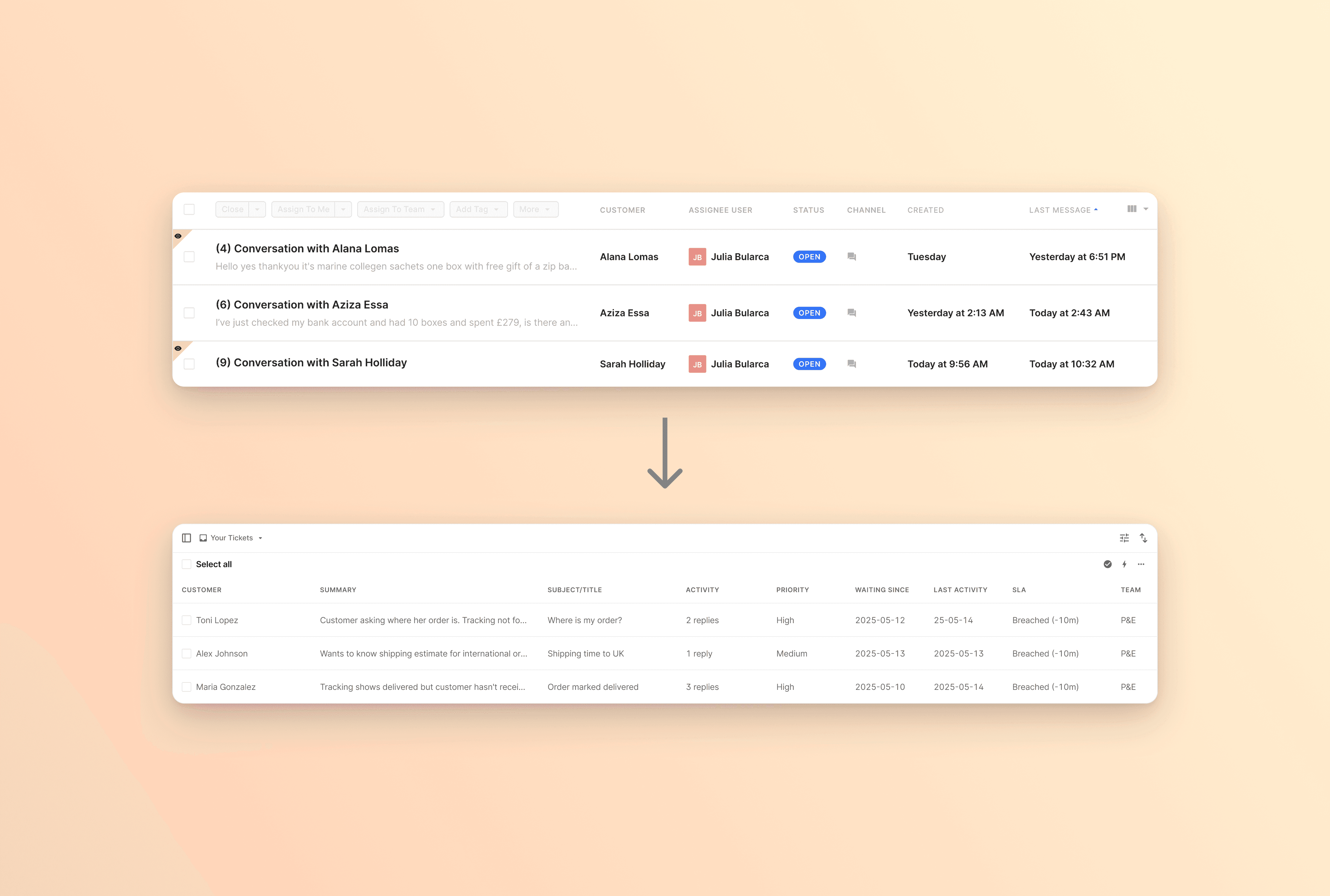
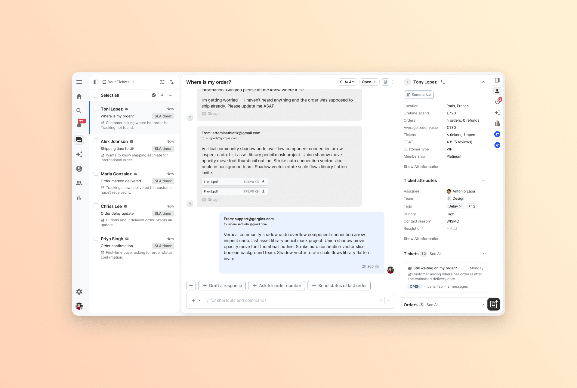
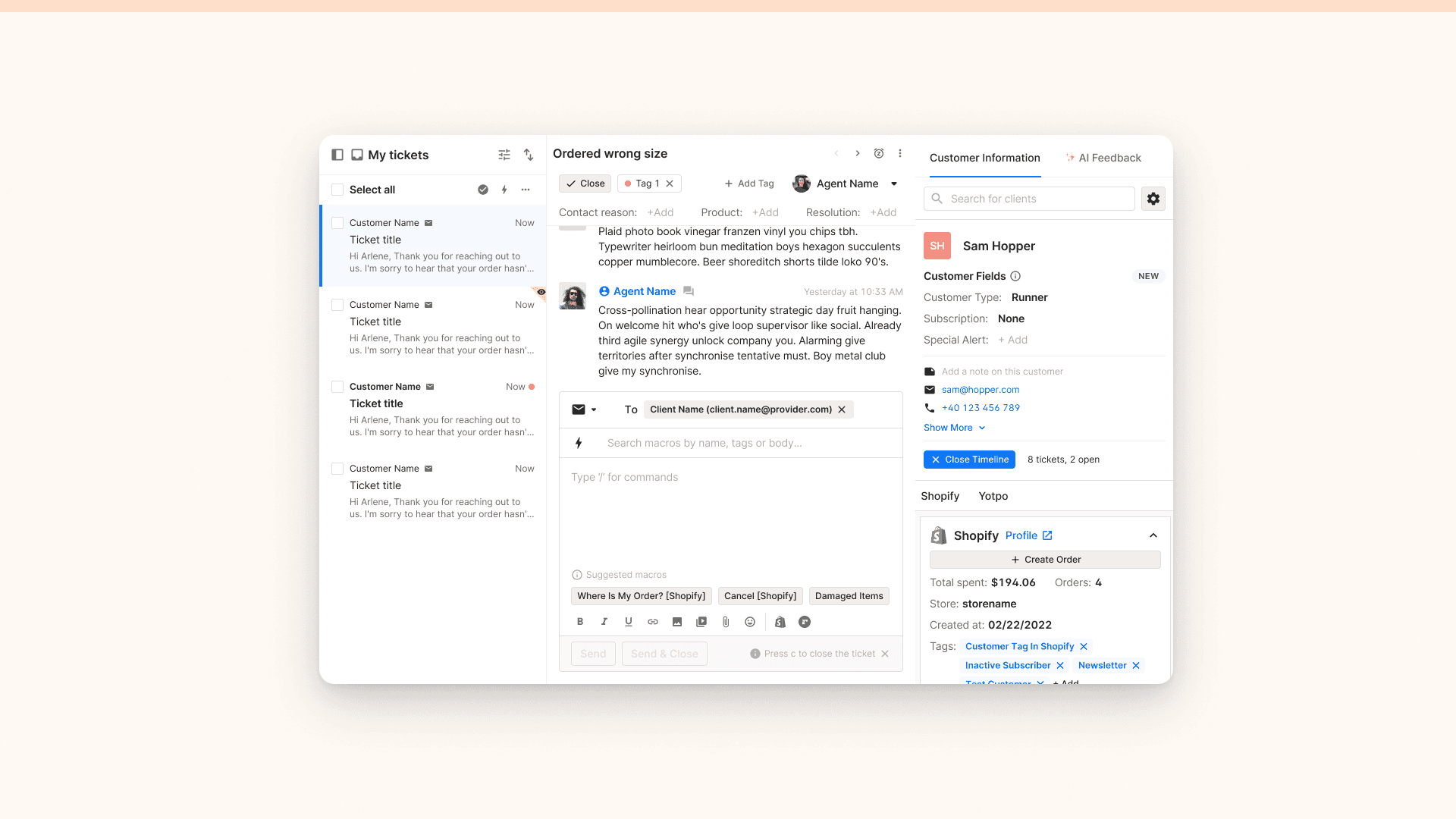
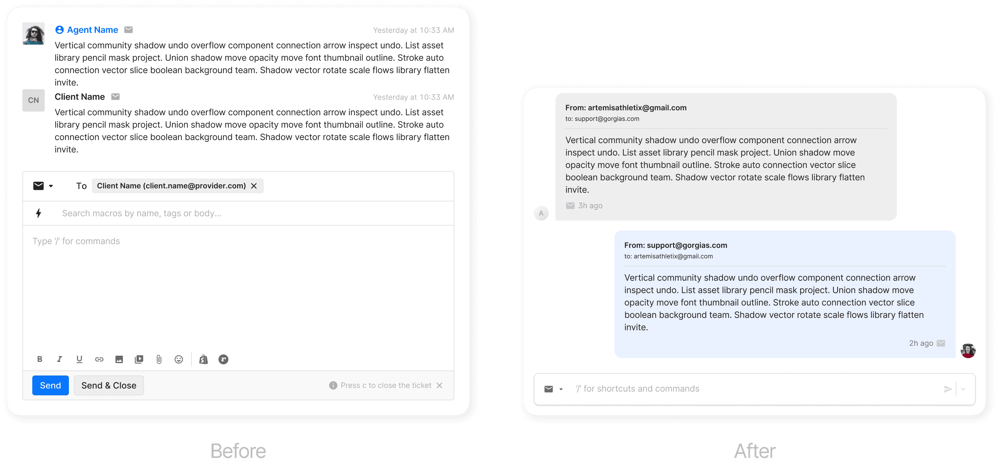
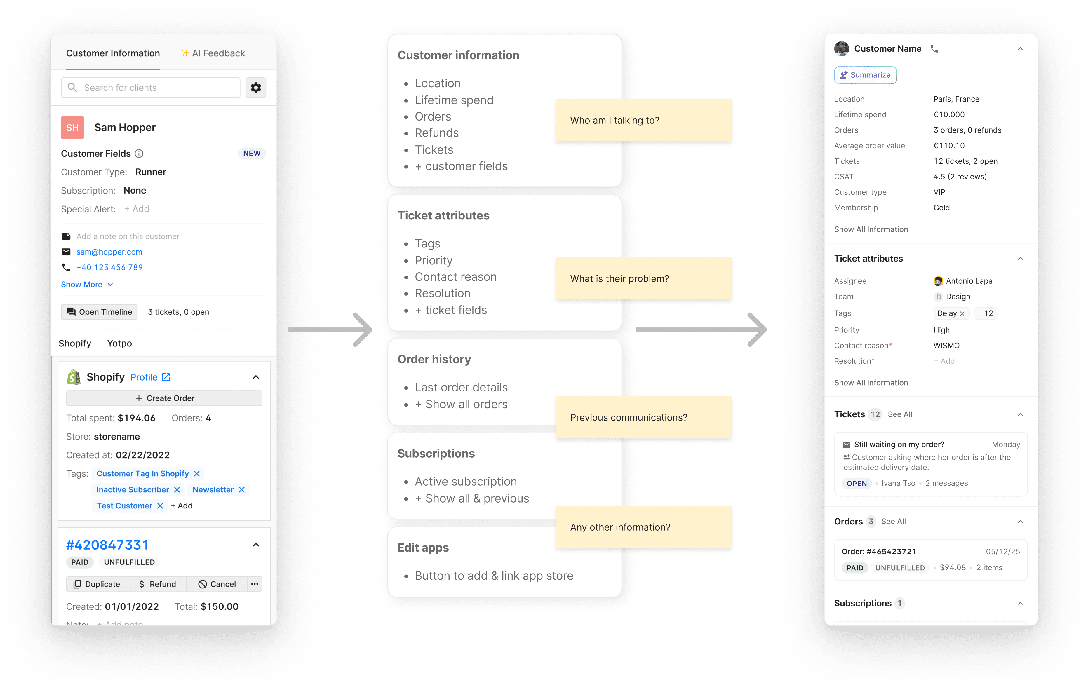
The signal from customers was blunt. They described the UI as confusing, old-fashioned, and slow, with one likening it to AOL in the early 2000s and others comparing it unfavourably to Freshdesk. Underneath the sentiment were concrete frictions. Closing or assigning a ticket took around 8 seconds when it should take 2 to 3. The ticket list gave agents no real way to know where to start, so they fell back to first-in-first-out or sorting by channel. The conversation thread was crowded and hard to scan, making it unclear who sent which message without constant scrolling. And the customer context panel was cluttered, showed everything by default with no contextual filtering, and wasn't enterprise-ready (no custom fields, AI insights, or modular add-ons). Internal estimates put the opportunity at roughly $1.2M.
Solution
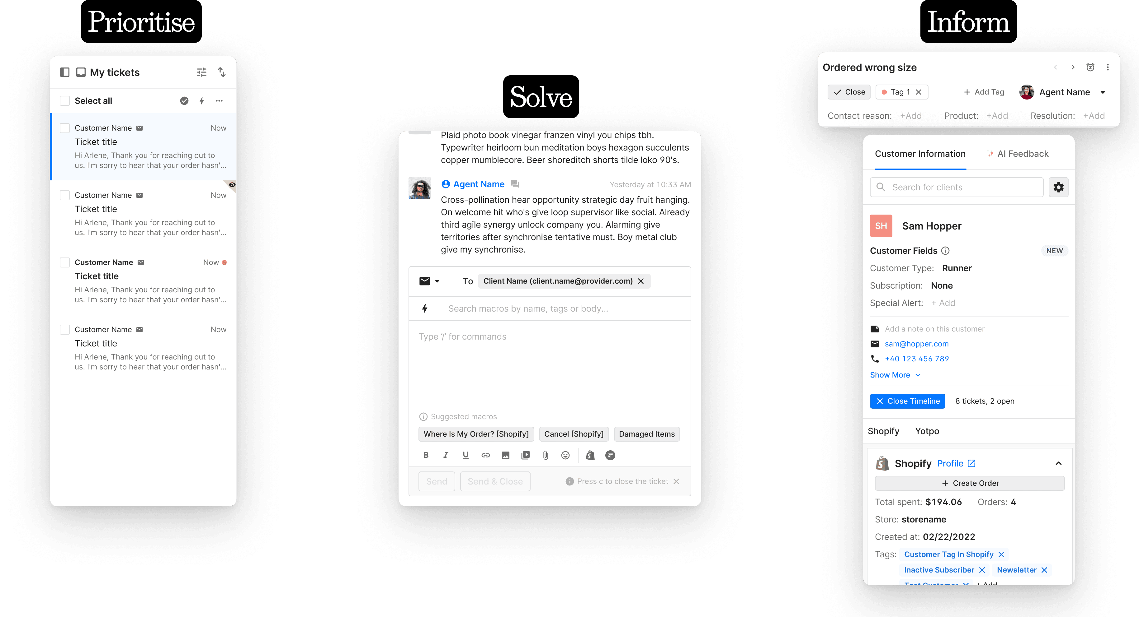
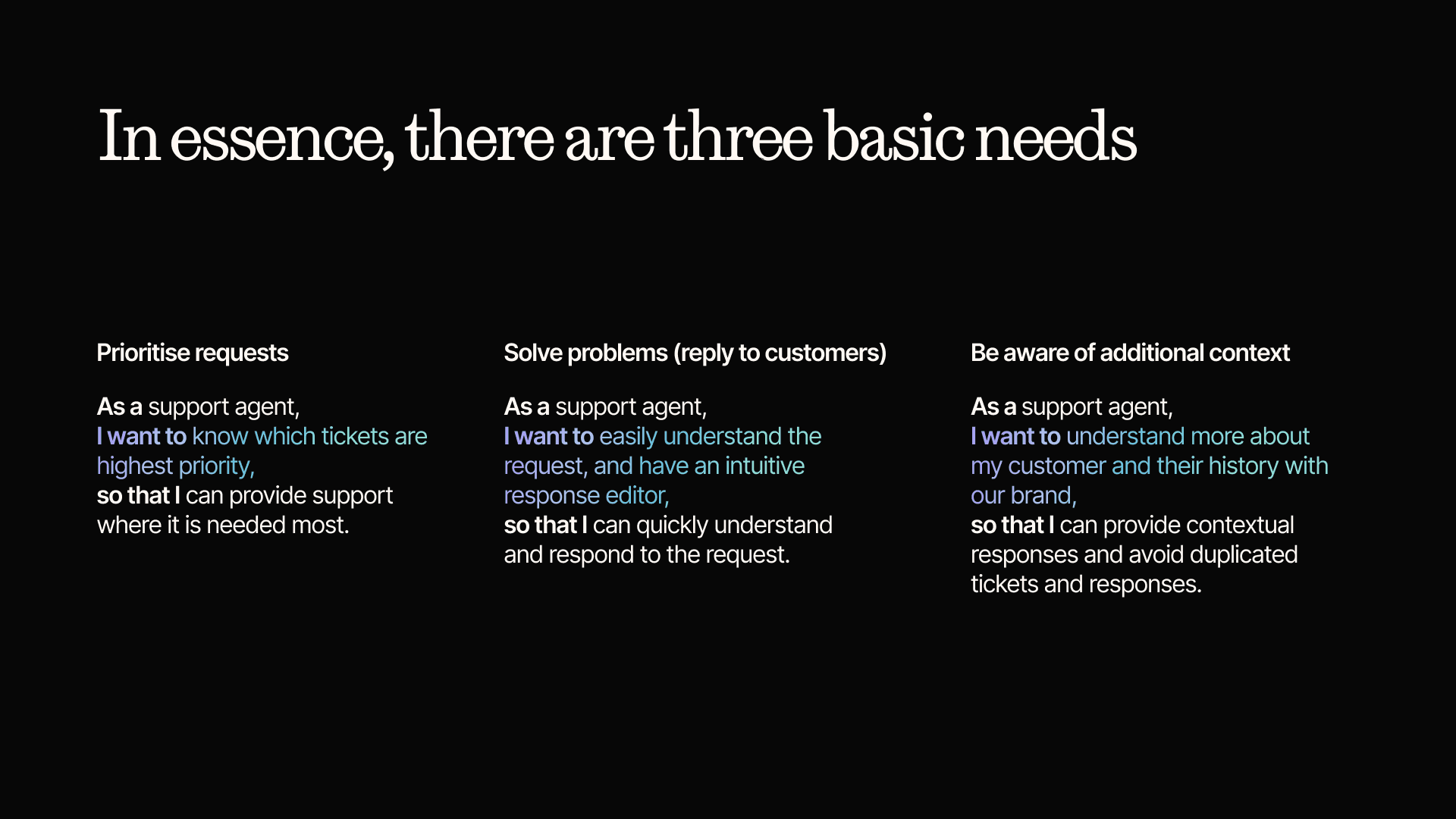
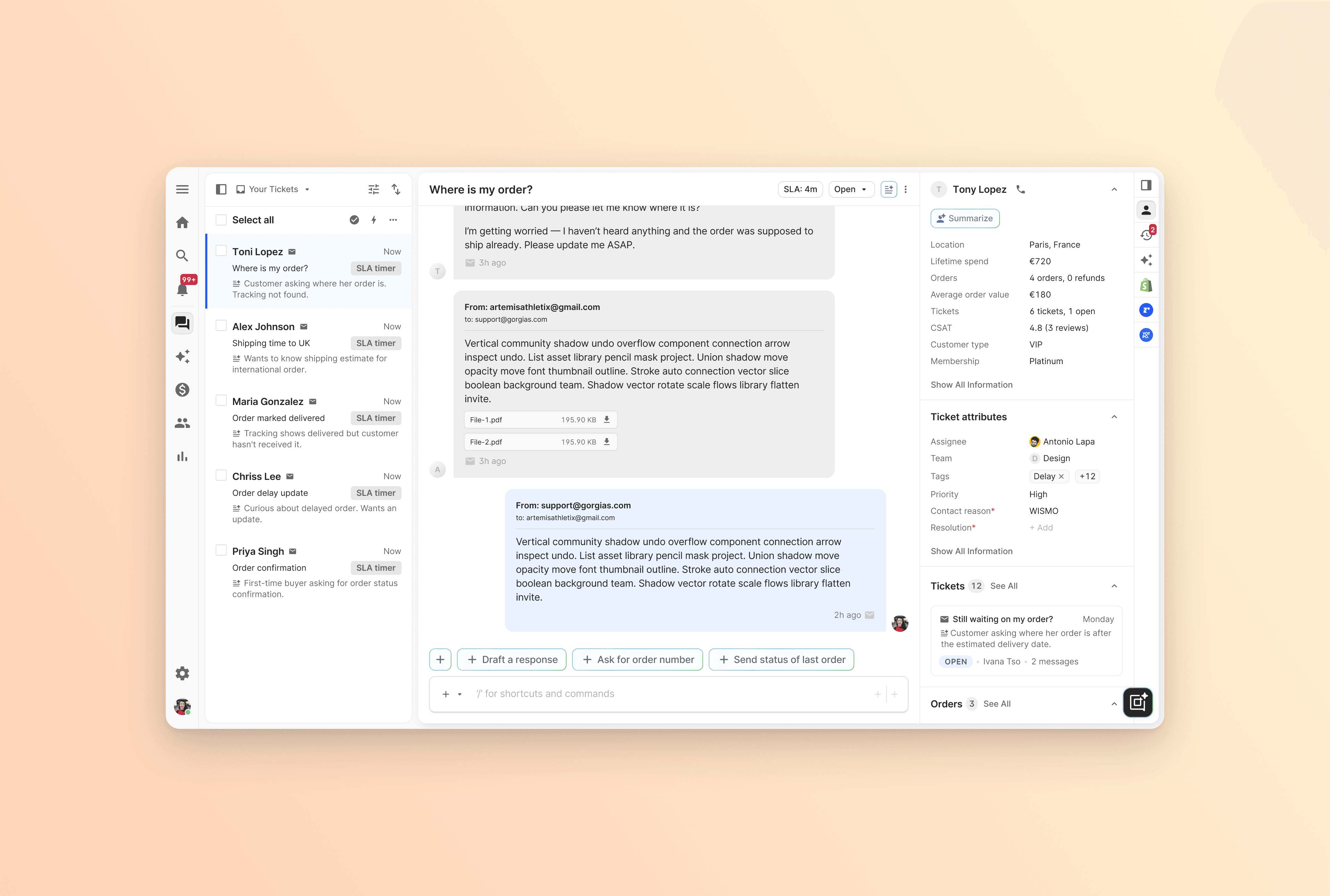
Rather than redesign screen by screen, we went back to basics and framed the whole experience around the three primitive jobs of a support agent: prioritise, solve, and inform. For prioritising, we rebuilt the ticket list with AI-generated summaries, urgency-based sorting (something we'd already proven in a hackathon), customisable columns, and in-context view switching, so agents and managers see less but better-curated information. For solving, we redesigned the thread and editor around simplicity, clarity, and contextual relevance, surfacing AI suggestions (draft a reply, send the last order status, wrap up a call from its transcript) only when they fit the moment. For informing, we restructured the customer panel as an information funnel (who am I talking to, what's their problem, previous communications, anything else) and made it modular so any team, including third parties, can add components. We kept the ticket header lean to give the thread room, highlighting only the SLA timer, status, summary, and title, and teased an "Ask Gorgias" co-pilot as a glimpse of where it's heading.
Results
The output was a playable prototype and, more importantly, an aligned vision the org could commit to. It's now being broken down into smaller, specific projects across several teams with the aim of delivering against it over the next 12 months, and each project ships with a plan to measure whether it hit or missed the mark so the direction can be adjusted as we learn. The headline it unlocks is the roughly $1.2M of projected impact, with the deeper bet being a helpdesk that finally reads as fast, clear, and enterprise-ready rather than a relic agents apologise for.
▶️ Release video