
2025
Player controls redesign

Overview
The Session Replay player is where people watch recorded user sessions. Its timeline and controls had grown organically and were starting to strain: dense sessions became unreadable, inactivity wasted space, and there was nowhere to put the AI chapter markers that were coming. This was a focused refresh of the player timeline and controls, my first major project at Datadog. The intent was not a ground up rethink, because people had built habits around the player, but to make the timeline coherent at any density, turn skip inactivity into a real setting, and prepare the surface for AI generated chapters.
Problems
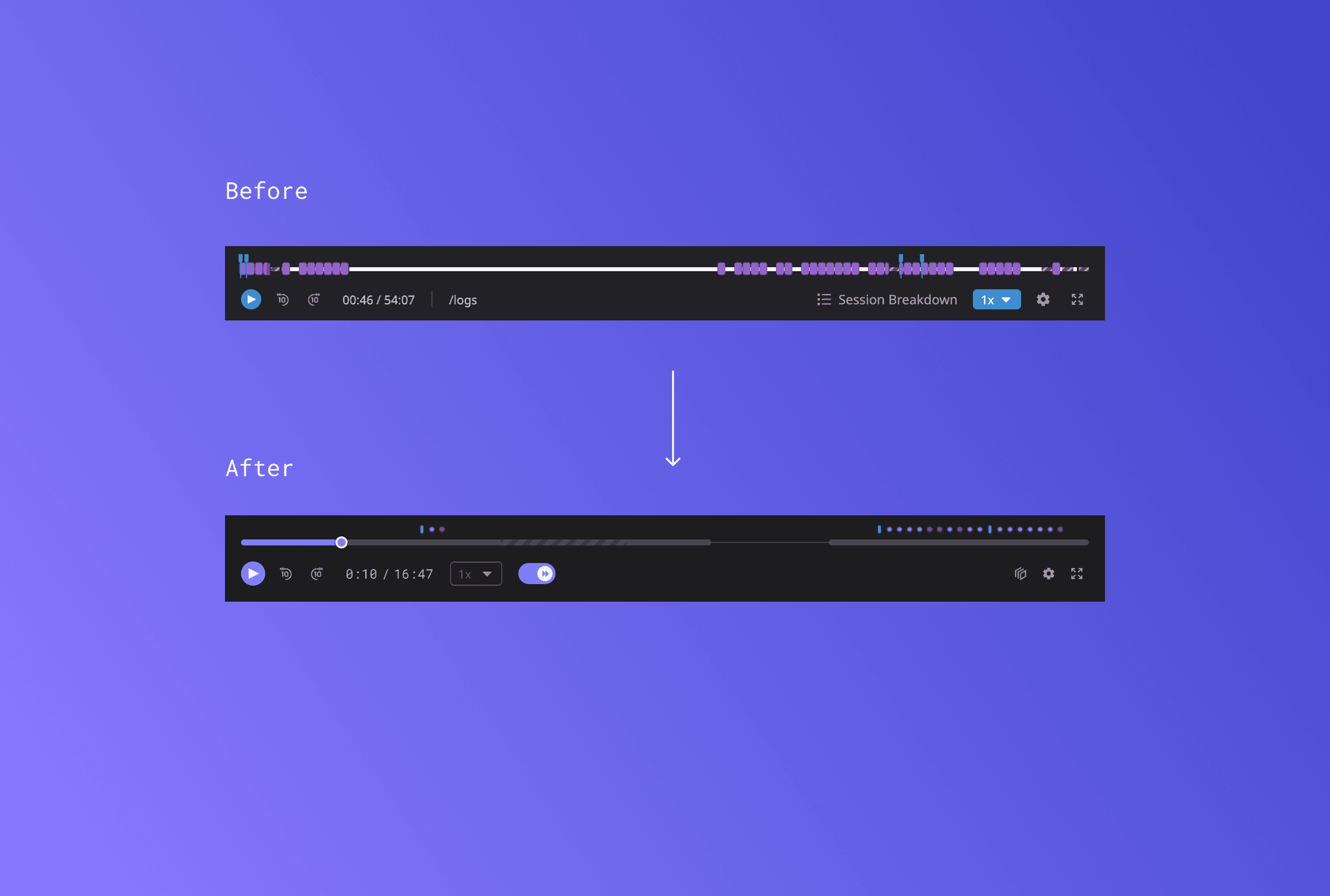
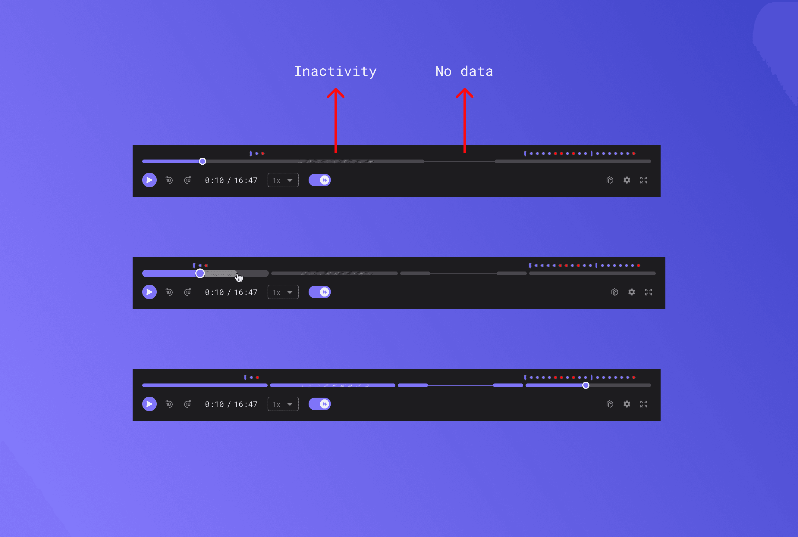
The timeline was doing too many things at once. Events of different types sat side by side with no hierarchy, and above a certain density the markers collapsed into each other, so a thirty minute session with two hundred events became unreadable. Inactivity gaps, periods where the user did nothing, took up space without communicating anything. Skip inactivity existed as a feature but had never been resolved as a setting: where it lived, what the default should be, and whether it persisted between sessions were all open. On top of that, Smart Chapters (AI generated highlights) were on the way with no home on the timeline, and the controls themselves lacked the affordances people expect from a media player they trust.
Solution
I started at the data level, with the event aggregation logic, because decisions about density had direct engineering consequences. From there I defined a threshold system: at low density show individual events with their labels, at medium density group adjacent events of the same type, at high density switch to a condensed bar. Events that were present but de-emphasised were dimmed to 50 per cent rather than hidden, because hiding felt like data loss and a dimmed presence still told people the events were there. I made skip inactivity a persistent user preference (default on, surfaced in the toolbar, following you across sessions) with a sensible starting threshold to revisit once we had real usage. I defined a chapter marker pattern that sat above the event track so Smart Chapters had a home from day one. Because the states were too complex for a static spec, I built an interactive prototype covering every density state, chapter hover and click, the skip toggle, zoom, and the asynchronous loading of chapter content. And at the December review I split the work into now versus a drafted V2 list, which protected scope without dismissing good ideas and gave engineering a clear contract to build to.
Results
The timeline and player controls shipped in the Q4 2025 cycle. The density thresholds kept dense sessions legible instead of collapsing, skip inactivity became a setting people could trust and keep, and the chapter pattern meant Smart Chapters landed cleanly in Q1 2026 with no disruptive rework of the timeline. The event grouping patterns also carried into later work on the event stream. The lesson I took from it, and have leaned on since, is that threshold decisions, where you draw the line between dense and sparse, are UX calls with engineering consequences, and owning that line explicitly in the spec is part of the design job.


